

As the bull market tries to enter its fifth year, many are wondering if it still has legs - but a handful of stock market charts warn there's high risk of a coming sell off.
In fact, a recent report from Credit Suisse Group AG (NYSE ADR: CS) outlined 10 technical factors that show the market is at its most risk-on level since just before the stock market crash that began in 2007's third quarter.
"Many of our tactical indicators point to a consolidation phase in the equity markets, in the near-term," Credit Suisse Global Equity Strategist Andrew Garthwaite said in a note to clients.
For a closer look at this bearish forecast, check out these five stock market charts pointing to a pullback.
Five Stock Market Charts Suggesting a Downturn
- Equity sentiment indicators are near a two-year high.

This stock market chart clearly shows investor enthusiasm is on the rise. The bulls will argue that the enthusiasm is warranted and the economy is improving, even if slowly.
But there's little doubt the rising stock market is masking our long-term debt and spending issues. The question is just how much longer the market can rise before a serious correction occurs.
- 86% of NYSE stocks are trading above 10-week MAs.
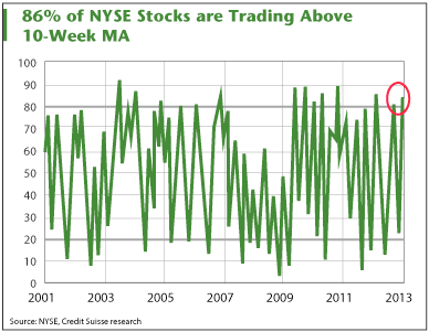
The fact that more than 80% of stocks are trading above their 10-week moving average, near all-time highs, is an indication of an overbought market.
- Hedge funds' net long positions are now at the highest level since August 2011.
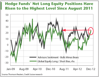
If you're a contrarian or think some hedge funds and Wall Street experts end the year losing to the S&P for a reason, this is your chart.
This chart is more evidence that euphoria is widespread among investors, even hedge fund managers. Their net long positions are nearing two-year highs and are much more bullish than their collective sentiments.
- U.S. credit risk appetite at historic peak levels.
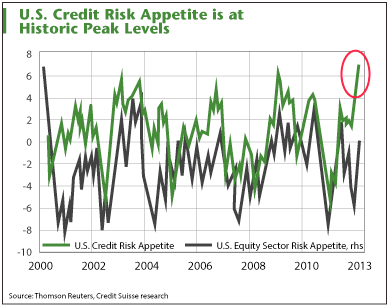
Credit Suisse's credit risk appetite index reached an all-time high and passed its euphoria level of 6, as the above chart shows. The equity sector risk appetite index is on the rise as well. An increase in these indices, according to Credit Suisse, is a sell signal as it indicates an unusually optimistic market.
- Speculative indicator position highest since 2007 Q3.
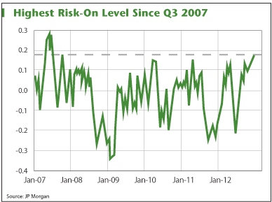
This chart displays JPMorgan Chase & Co.'s (NYSE: JPM) speculative position indicator over the past five years. The indicator measures overall positions held in eight "risky" assets versus seven "safe" assets.
As you can see, the level of risky positions continues to rise and we have been more speculatively positioned only once - when stocks peaked in the middle of 2007.
The "risky" assets are copper, the GSCI commodity index (heavily weighted in energy), the Australian, Canadian, and New Zealand dollars, the Russian ruble, Mexican peso and an aggregate index of equities based in the three major U.S. stock markets and the Nikkei. "Safe" assets include gold, the VIX, the Japan Yen, the Swiss franc, silver and an aggregate of U.S. Treasury and eurodollar futures, as well as an aggregate U.S. dollar index.
Related Articles and News:
- Money Morning:
Why The Fiscal Cliff "Deal" is Spelled P-O-R-K - Money Morning:
The Top Four Tech Stories That Keep Me Up Late At Night - Money Morning:
Here's Your Key to a Winning Financial Plan in 2013 - ZeroHedge:
The Ten Charts Ignored By Bulls - Bloomberg News: Hedge Funds Squeezed With Shorts Beating S&P 500