

Since gold's bull run began a decade ago, many people have asked me whether the metal was in a bubble, despite the fact that there were many drivers in place for gold.
Here's another comparison - shown in the chart below - that answers this classic question.
Research firm Commerzbank's strategists recently compared the price of gold starting in 2002 to the price of Brent crude oil starting in 1998 and the NASDAQ Composite from 1990.
Immediately following each index's record highs, oil and tech stocks declined sharply. Within nine months, tech stocks had halved in price, while it took only three months for oil to lose half its price, says Commerzbank. You can see the dramatic rise and fall of each index on the chart below.
In contrast to oil and tech, gold has been level-headed over the past decade. Nearly 20 months after its peak, gold has fallen only about 25%, and its path remains in line with Brent and the NASDAQ after their bubbles burst.
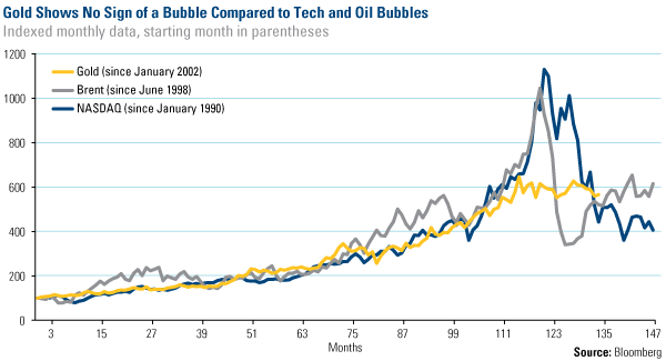
In Commerzbank's opinion, a comparison between the current situation in gold and the former bubbles is superfluous at best.
[Editor's Note: Frank Holmes is CEO and chief investment officer of U.S. Global Investors Inc., which manages a diversified family of mutual funds and hedge funds specializing in natural resources, emerging markets and infrastructure. He has been profiled by Fortune, Barron's, The Financial Times and other publications. If you want commentary and analysis from Holmes and the rest of the U.S. Global Investors team delivered to your inbox every Friday, sign up to receive the weekly Investor Alert at www.usfunds.com.]
Related Articles and News:
- Money Morning:
In Gold, Not Cyprus, We Trust - Money Morning:
Four Sensational Facts About Gold Investing That You Might Not Know - Money Morning:
Commodities are Wounded, But Far From Dead - Money Morning:
The Ultimate Gift for Your Gold Lover and 5 Other Amazing Consumer Trends