Investors ignore the Fed dot plot at their peril.
While it doesn't get as much attention as the decisions of the Federal Open Market Committee (FOMC) meetings or the comments by Fed Chair Janet Yellen, the Federal Reserve's dot plot is an important guide to where the central bank wants to go with interest rates in the future.
And that means it's closely watched by Wall Street, giving it the ability to influence markets.
Formally known as the U.S. Federal Reserve's Summary of Economic Projections, the dot plot is a simple tool the Fed introduced back in 2012 as part of its efforts to increase transparency. It's released four times a year, at alternating FOMC meetings, at the same time as the committee's policy announcement.
The next dot plot will be released Wednesday, Sept. 21, at 2 p.m.
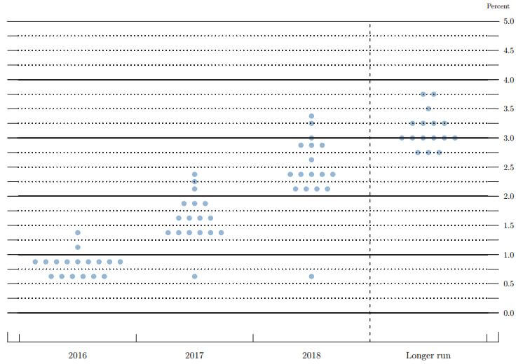
At its most basic, the Fed dot plot is a chart showing the outlook for interest rates for the current year, the next two years, and the "longer run." Each of the 17 members of the Federal Reserve board participates, even though only 10 are voting members of the policy-setting FOMC at any given time.
The members make a call for each time period; those are the dots. Each dot is a member's estimate of what he or she thinks the Fed interest rate should be at that time.
Here's the last Fed dot plot, from June's FOMC meeting:

Investors need to be cautious not to read the Fed dot plot as a prediction of what the Fed is actually going to do. Because the Fed is constantly considering new economic data in its analysis, any prediction of a change in the Fed interest rate - even one by the members of the Reserve Board - is destined to be inaccurate.
Get Our Best Wealth-Building Ideas: Money Morning's top 5 investment reports to grow your money like never before are right here - and they're absolutely free. Read more...
But there is other information that can be gleaned from the Fed dot plot...
"[The dot plot] shows what each participant thinks the Fed should do, based on his or her individual forecast of how the economy will evolve and what the optimal response would be," wrote former Minnesota Federal Reserve Bank President Narayana Kocherlakota in a Bloomberg opinion column in March.
So the Fed dot plot is essentially a window into the minds of the Federal Reserve members.
Now here's why the Fed dot plot has such a huge impact on Wall Street...
What Wall Street Looks for in the Fed Dot Plot
Wall Street's addiction to the Fed's low-interest-rate policy is well established. The abundance of cheap money has encouraged companies to borrow more and consumers to spend more. It's one of the chief reasons stocks are trading near all-time highs.
When the Fed starts raising rates, the effect reverses. That's why even a single hawkish comment from a Fed member can cause an almost instant nosedive in the markets.
It's also why Wall Street values any clues to shifts in the Fed's interest rate policy. And the Fed dot plot is one of the best clues available.
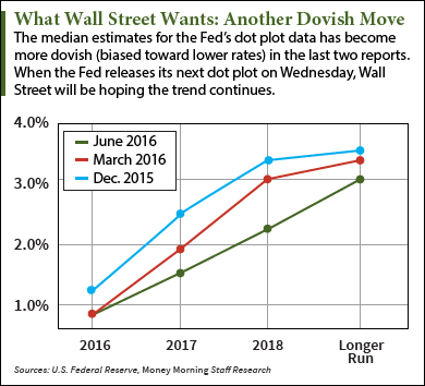
The dot plot is most useful in identifying trends. In addition to the dots, the Fed also calculates the median of the estimates for each time period. That makes changes in member sentiment easier to spot.
So even if the FOMC declines to raise interest rates, changes in the dot plot and the median numbers can signal a more general shift in member opinions.
 At the March FOMC meeting, for example, the committee kept interest rates unchanged. But the dot plot showed that members' expectations for future 2016 rate hikes had dropped from four to two. The dovish move came as a relief to the markets, which had feared the impact of a steady succession of rate hikes.
The dot plot also adds color to the degree of division among the members of the Fed board. The further apart vertically the dots are, the less the members agree on policy. The more horizontal they are, the closer the members are to a consensus - making future policy changes more likely.
Since September a year ago, the dot plot has been moving in a more dovish direction despite the talk about more Fed rate hikes. It's no coincidence that the Standard & Poor's 500 Index is up 9% over the past 12 months.
On Wednesday, the markets will obsess over the usual - whether the FOMC holds the line on interest rates as expected and what Fed Chair Janet Yellen has to say. But Wall Street will also be studying the latest dot plot for clues about what the Fed will do next - and reacting accordingly.
Next Up: Regardless of what the FOMC does this week, years of historically low interest rates have already taken a heavy toll on certain parts of the population. These are the groups that have gotten hit the hardest...
Follow me on Twitter @DavidGZeiler or like Money Morning on Facebook.
About the Author
David Zeiler, Associate Editor for Money Morning at Money Map Press, has been a journalist for more than 35 years, including 18 spent at The Baltimore Sun. He has worked as a writer, editor, and page designer at different times in his career. He's interviewed a number of well-known personalities - ranging from punk rock icon Joey Ramone to Apple Inc. co-founder Steve Wozniak.
Over the course of his journalistic career, Dave has covered many diverse subjects. Since arriving at Money Morning in 2011, he has focused primarily on technology. He's an expert on both Apple and cryptocurrencies. He started writing about Apple for The Sun in the mid-1990s, and had an Apple blog on The Sun's web site from 2007-2009. Dave's been writing about Bitcoin since 2011 - long before most people had even heard of it. He even mined it for a short time.
Dave has a BA in English and Mass Communications from Loyola University Maryland.


