

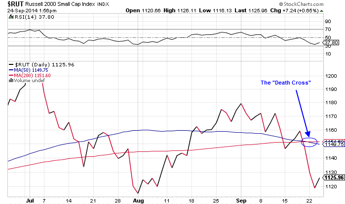
The term "death cross" has been making the rounds in financial headlines recently as the Russell 2000 has breached this technical indicator.
 Click to Enlarge |
That is, the small-cap index has seen its 50-day moving average dip below its 200-day moving average, a bearish signal to traders who see this as a precursor to a protracted downtrend.
But for all the fear that surrounds the ominous death cross, what usually happens next shows it doesn't actually warrant such a spooky moniker.
A "death cross" sounds pretty darn serious, but in reality, it's little more than a sensational sound bite," said Money Morning Small-Cap Specialist Sid Riggs.
Just look at the S&P 500 over the last 20 years...
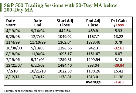
Since 1994, the 200-day moving average crossed the 50-day moving average nine times.
For seven out of those nine occurrences, the S&P actually finished above the level it traded at when the lines both first crossed, just before the 50-day moving average once again overtook the 200-day moving average and hit what is called the "golden cross" - the death cross's bullish counterpart.
But first, here's why traders fear the dreaded death cross...
Why Do Some Traders Fear the Death Cross?
To understand the cross, it's important to first understand what the moving day averages tell us about market movements.
Generally, the moving averages provide a smoother trend-line that allows traders to determine exactly what direction the market is moving without the intraday volatility.
It is an average of closing prices over a certain timeframe. The 50-day moving average is calculated by taking the average closing prices of the last 50 days of trading.
After each day it is updated to reflect that day's close, which is why it is called a "moving" average.
The shorter the time frame, the more sensitive that moving average will be to the intraday volatility. So the 50-day moving average will typically move more dramatically than the 200-day because a smaller sample of closing prices means each one has a larger weight on the final average. That's why one day of decline is not typically cause for panic.
But when a decline in the 50-day moving average becomes so entrenched that it threatens the 200-day moving average, traders begin to worry. When these two averages cross, it indicates that the 50-day average is just a slight drop away from bringing down the longer-term trend line. When the much broader 200-day pattern dips, traders begin to fear that consistent declines are setting in.
"When the 200-day moving average does change direction it's a bigger deal because it took so much to get that change," Money Morning Resource Specialist Peter Krauth said.
But despite everyone's fears, that has rarely been the case, at least over the last 20 years...
What the Death Cross Really Means for the Markets
At this point, the fears of the death cross are bigger than the pattern itself, which has been given credence by traders who focus on shallow technicals.
"The fact that over time those have been the averages that traders have watched... they have become accepted gauges or benchmarks," Krauth said.
Krauth said when a lot of traders act on these indicators it can be a "self-fulfilling prophecy." But as the chart below shows, the death cross hardly signals a death sentence for the markets.
Since 1994, when the death cross has been breached in the S&P 500, only twice has it not recovered.
And both of those times were during recessions, when overarching economic malaise, not technical patterns, drove down drove markets.
During six death cross periods (one period is omitted because it lasted only five days), it took the markets an average of 25 days to recover all its losses. The last time the S&P hit the death cross was August 12, 2011, where it took a rather long 73 days to trade back at the level it did in the beginning of the period.
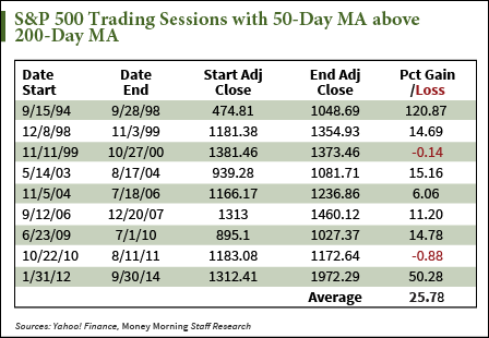 However, by the time it hit the golden cross on January 30, 2012, the S&P had gained 11.4%.
Sometimes, the death cross has done nothing to markets. In 2010, during a period when the 50-day line dipped below the 200-day line, the S&P never dropped below the level at which it entered that period.
While on average, investing in the face of the death cross would produce a loss of 1.8%, that data is skewed by recession-driven declines, and not a technical trading pattern.
Those other seven times, by fleeing the market at the sight of the cross, you would have missed out on an average 8% gain. And the last two death crosses have produced 15.4% and 11.4% returns, respectively.
Interested in Technical Analysis? This 13th century tool can make you serious money today...
[epom]