There are two economic factors that make timing the market now more lucrative than ever. The first is major market indexes continuing to hit all-time highs. Second is the increased market volatility that comes with a new presidential administration.
You see, timing the market now could make the difference between buying stocks too high or getting into a trade ahead of the crowd.
However, most people think timing the market can't be done. That's because their financial adviser continues to warn them against it. But these advisers are talking about timing the market as a whole.
No one can time the market as a whole. Too many unknown things can happen at any given time. For instance, few predicted the extended "Trump Bump" (except of course our own Chief Investment Strategist Keith Fitz-Gerald).
While you can't predict the overall market, one thing you can predict is which individual stocks will rise or sink. Individual companies are easier to predict because of their metrics and seasonal business cycles.
In fact, Money Morning Options Trading Specialist Tom Gentile recently netted his readers a 100% return in 24 hours by timing the market. On Jan. 30 he saw the buy signals for AbbVie Inc. (NYSE: ABBV) and advised his readers to buy call options. By Tuesday afternoon, the trade had doubled.
Gentile prefers visualizations and graphs in market timing strategies. His favorite is Japanese Candlestick Charts. These charts let you see a stock's open and close prices and everything in between at a glance.
"Like many professional traders, I favor these charts because of the story they tell over and above your basic bar chart," said Gentile.
Best of all, once you understand the basics of candlestick charts, you can combine them with other strategies for timing the market for maximum profit...
How to Boost Profits with Japanese Candlestick Chart
Gentile loves candlestick charts because they give you so much information at just a glance. A single candlestick can tell you the open price, close price, high price, and low price for a stock on any given day. All of that information forms what is called the "body" of a candlestick.
Don't Miss: I'm showing my readers how to double their money in 30 days or less.
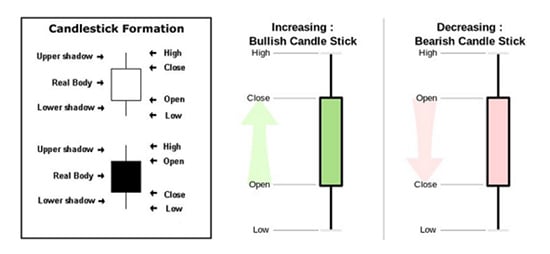
The body of the candlestick is formed by the open and close price of the stock. If the stock is bullish (rising), the open is the bottom line of the rectangle, and the close is the top line of the rectangle. The color of the body of a bullish candlestick will be either white or green.
If the candlestick is bearish (falling), the open price is the top line of the rectangle, while the close is the bottom line of the rectangle. It will be colored either black or red to show that the stock price dropped that day.
The uppermost point of the candlestick is the highest point the stock traded that day, while the lowest point of the candlestick is the lowest point the stock traded. The high point and low point show you the trading window of stock for that particular day.
The chart below explains how each candlestick body is formed.
With each day of trading summed up in a single candlestick, you can easily see trends.
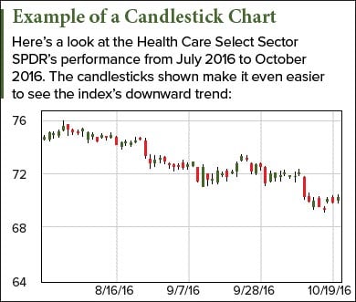 By compiling a month of data, you can see if the close price for a stock is rising or falling. You can also see how wide of a range a stock is trading day to day. All of this information helps you to determine when to enter and exit a trade.
For example, the Health Care Select Sector SPDR chart to the right shows a bearish trend. Overall it has more bearish days than bullish days (as can be seen by having more red candlesticks than green). The index also has more days that are bearish than bullish with a wide trading range for the day.
Aside from general trends that can be seen, there are specific patterns to look for to know when a trend is about to reverse...
Timing the Market Now with Candlestick Patterns
[mmpazkzone name="end-story-hostage" network="9794" site="307044" id="138536" type="4"]
Candlestick charts have two types of patterns: reversal and continuation. Reversal patterns indicate that a trend is reversing, while a continuation pattern indicates that the current trend will continue.
Gentile likens price moves to a battle between bears and bulls. If the price of a stock rises that day, the bulls won. If it drops, the bears won. When there is a narrow trading range, it means the match is fairly even. A wide trading range means one group is overwhelmingly the majority that day.
This battle between the bears and bulls plays out over several days to form patterns in the candlestick charts. While there are many different patterns, we will focus on Gentile's eight favorite reversal patterns.
- Piercing Pattern
- Bullish Engulfing Pattern
- Morning Star Reversal Pattern
- Bullish Kicker Pattern
- Dark Cloud Cover Pattern
- Bearish Engulfing Pattern
- Evening Star Reversal Pattern
- Bearish Kicker Pattern
Piercing Pattern: This pattern is a bullish two-day reversal pattern, which means that over a two-day period a downward trend is reversing.
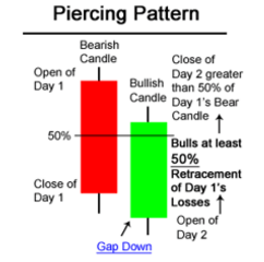 Day one will be bearish, meaning the stock price closed lower than it opened.
On day two, the stock will open lower than it closed the day before (gap down). Then it will end the day above the close price of day one and "pierce" the body of the previous day's candle.
It is important that the second day close at least halfway up the day one candlestick body or the trend may not be strong enough to reverse. The closer the day two close price is to the day one open price, the better.
The chart to the right gives a visual of what a piercing pattern looks like.
Bullish Engulfing Pattern: This pattern is also a bullish two-day reversal. It is made up of a bearish day followed by a bullish day, but that's where the similarities end.
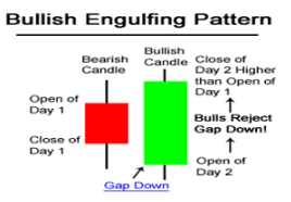 The difference is that instead of the bullish day "piercing" the candle body of the bearish day, it completely engulfs it. That means the bullish day opens lower than the previous close and closes higher than the previous open.
The chart to the right gives you a visual of what the bullish engulfing pattern looks like.
Because the price jump is so much bigger than the piercing pattern, this is a stronger indicator that a bearish trend is reversing and becoming bullish.
Morning Star Reversal Pattern: This pattern is a bullish three-day reversal pattern. That means it will take three days to develop and is usually a stronger indicator of a trend reversal than a two-day pattern. That's because you have more information available to see where the trend is going.
Day one of the morning star reversal pattern is a bearish candlestick.
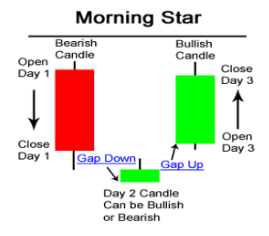 Day two of the pattern is a small candle body that opens lower than the previous day's close (gap down). It can be bearish or bullish. The important thing here is that the trading window was really small for day two.
The last day of the pattern is a bullish day. It opens higher than the previous day's close (gap up). The closer day three closes relative to day one opened, the better.
The chart to the right gives you a visual of what the morning star reversal pattern looks like.
Bullish Kicker Pattern: This is one of the most reliable two-day reversal patterns. That is because the reversal is more dramatic than the other two-day patterns.
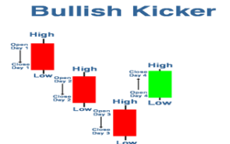 Day one is a bearish candle body. It usually has had a series of bearish days leading up to it.
The next day, the stock opens higher than it closed the day before (gap up). Then it continues to rise to close even higher.
The chart on the right shows a visual of what a bullish kicker pattern looks like.
Dark Cloud Cover Pattern: This pattern is the opposite of the piercing pattern and is a bearish two-day pattern.
In this pattern, day one is bullish.
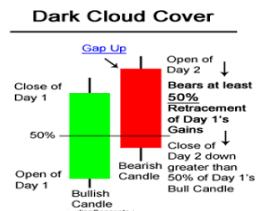 Day two opens higher than day one closes (gap up). It then reverses and closes lower for the day. Just like the piercing pattern, the close needs to go down to at least half of the day one candle body.
The lower it closes compared to day one of the pattern, the better.
The graph to the right shows what a dark cloud cover pattern looks like.
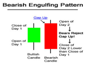 Bearish Engulfing Pattern: This pattern is the opposite of the bullish engulfing pattern and is a bearish two-day reversal pattern.
Day one is a bullish candle body.
On day two, the stock opens higher than it closed the day before (gap up), but closes lower than it opened on day one.
The graph to the right shows what the bearish engulfing pattern looks like.
Evening Star Reversal Pattern: This pattern is the bearish version of the morning star reversal pattern. It is a three-day pattern that shows a bullish run is reversing.
Day one is a bullish candle body.
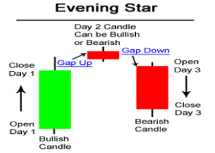 The next day opens higher than day one closed (gap up). It is also a trading day with a very narrow trading window.
Day three opens lower than day two closed (gap down). It continues the downward trend to close within the day one candle body. Like the piercing pattern, you want the close to be at least at the halfway point of the day one body. The closer day three closes to day one's open price, the better.
The picture to the right shows what an evening star reversal pattern looks like.
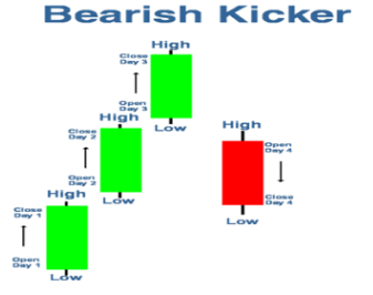 Bearish Kicker Pattern: This is the opposite of the bullish kicker pattern. It is a bearish two-day pattern.
Day one is a bullish candle body and usually has had a series of bullish days leading up to it.
The next day, the stock opens lower than it closed the day before. It then continues to fall to close lower.
The chart on the right shows a visual of what a bullish kicker pattern looks like.
Putting the Candlesticks Together
While these patterns are effective at signaling a reversal, there are a few things to keep in mind.
If the trend is bullish and you see a bullish pattern like the bullish engulfing pattern, it is not signaling a reversal. This is because the trend is already bullish.
The same goes for bearish reversal patterns. If the trend is already bearish, a reversal pattern cannot indicate that the trend is reversing to be bearish.
The Bottom Line: Candlestick charts are a great way to manage a lot of information about a stock's price movement in an easy-to-understand format.
Like all market timing strategies, you need to make sure you factor in information such as current economic conditions and company press releases before you buy or sell a stock.
Editor's Note: If you want to learn more about Tom Gentile and timing the markets, you can follow him on Power Profit Trades. He will tell you the simple move that puts his readers in a position to make double-digit profits.


