As traders, we're constantly on the lookout for the next big winner.
So the more opportunities we find, the better, right?
Yes... but there's a big catch.
You definitely want lots of chances to put on a trade, but the quality of those chances means a lot more than the quantity of those chances.
Finding the right trade is more important than finding a trade.
Fortunately, I know a dead simple way to bull's-eye the right trades. I just look at whether this red line is on the top side of my chart or the bottom.
[mmpazkzone name="in-story" network="9794" site="307044" id="137008" type="4"]
Say Goodbye to Subjectivity and Doubt
As humans we have intuition, feelings, hopes, little hairs on the backs of our necks that stand up - but when we allow those to influence our trading decisions, it often leads to failed trades. A famous study showed that 85% of investors make the wrong decisions at the exact wrong time, leading to incalculable losses.
So when we see independent data that points to a simple "yes or no," "in or out" conclusion... that data's worth its weight in gold.
You Could Soon Fall Victim to ReHIREment: The terrifying new normal affecting 9 million Americans was completely out of their control. Full Story...
That's why I love to trade on technical indicators, like the moving average convergence divergence (MACD) indicator; it points to discrete entry and exit points that enable us to trade on what we see and know - not what we feel.
The MACD indicator was invented by Gerald Appel in the late 1970s. It's a great indicator for determining both changes in trend direction as well as trend strength.
The MACD is constructed by calculating the difference between a 12-day short-term exponential moving average (EMA), and a long-term 26-day EMA.
The signal line is typically a nine-day EMA. The MACD is plotted along the signal line - I'll show you how in a second.
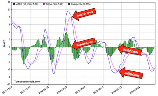
That might sound complicated, but for folks like us, reading the chart couldn't be easier: If the MACD line crosses below the signal line, it's signaling a bearish trade. If the MACD signal crosses above the line, you're looking at a bullish setup.
This MACD chart illustrates it perfectly, with the MACD line colored blue and the signal line colored magenta.

You can see right there, a bearish cross is signaled when the blue (MACD) line crosses below the magenta (signal) line and vice versa.
Another great reason to use this technical indicator is it can help you determine the strength of a trend by looking at how quickly the MACD line is moving away from the signal line.
If there's more space between the MACD and the signal line, the trend is stronger. A shorter distance means a weaker trend.
But there's an even simpler way to look at the MACD. It's called a histogram, and that's just what you were looking at.
The histogram is depicted as green bars extended above and below the zero line.
When the histogram moves above the zero line, we have a bullish cross. When the histogram drops below the zero line, we have a bearish cross.
And of course, the strength of trend is determined by the size of the histogram.
So, now that we understand how the MACD works, let's take a look at how well it predicts direction on an actual chart.
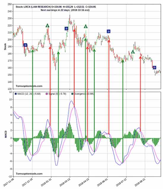
Below is a chart of Lam Research Corp. (NASDAQ: LRCX) along with its MACD chart.
The green vertical lines signify a bullish cross and the red vertical lines a bearish cross. You'll also notice that the MACD/signal line crosses correspond with the MACD histogram crosses.

In all but a few cases, the crosses all led to a significant short-term move in the direction that the cross indicated.
Perfect...
Now, Here's What You Do with the MACD
The MACD is a popular momentum indicator that traders use to measure the strength and duration of a trend.
$936,930 Broker Fees Produce Victims by the Minute: Find out how to avoid this outrageous fee (and the sad fate of millions of Americans) altogether right here.
But you can also use it to get ahead of the trend when it signals a reversal... You can use MACD to get into and out of your trades early.
If the MACD line crosses above or below the zero line, it could mean a trend or reversal is forming - a reversal that will be confirmed later if the signal line crosses the zero line.
Likewise, if the MACD line crosses the signal line, it could be an even earlier indication of a reversal.
It won't exactly tell you how much or when a stock will move, but it can help you choose between taking a bearish stance, with, say, puts, or a bullish one, with calls.
Here's how you might use MACD and profit in real life.
Use a tight trailing stop (5% on stock, 25% on options).
Use a 10-day simple moving average:
Exit bullish trade with a close < 10-day MA. Exit bearish trade with a close > 10-day MA.
It's dead simple, like I said, but MACD is an excellent indicator that can improve your accuracy and find you better, more frequent trading opportunities.
Pull up some charts and test it out for yourself.
Meet the "ReHIREees"...
Every single day, thousands of folks who thought they were retired reenter the workforce. The tally now stands at 9 million, but it's slated to increase to 14.7 million over the next several years.
Tom Gentile's got the shocking story here. He's even invented a way for you to avoid reHIREment entirely - whether you're already retired, preparing to retire, or are still a few years away.
Follow Money Morning on Facebook, Twitter, and LinkedIn.
About the Author
Tom Gentile, options trading specialist for Money Map Press, is widely known as America's No. 1 Pattern Trader thanks to his nearly 30 years of experience spotting lucrative patterns in options trading. Tom has taught over 300,000 traders his option trading secrets in a variety of settings, including seminars and workshops. He's also a bestselling author of eight books and training courses.


