Sorry, no content matched your criteria.
Featured Story
These Stock Charts Prove Markets Are at a Tipping Point
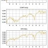
These stock charts all show different market indexes. They all look the same. Don't they?
And they're not the only indexes that look this way - check out the Dow Jones Transportation Average and the PHLX Semiconductor Index as well.
Not only do they look the same, but they're all pointing to the same place - a danger zone.