Barely two trading weeks after some of the steepest, quickest losses of 2016, and U.S. stocks are all over all-time highs.
The S&P 500 has topped 2,166, the Dow set a closing high of 18,526, and the Nasdaq, lagging behind a bit, closed above 5,039.
So the bulls are clearly running the show right now.
But here's the thing: That could change. I'm looking at an upcoming "event" that happens today, in fact, that could send the markets to even higher highs... or signal a wipe out of the gains of the past few days.
But don't worry at all - this represents a chance to make money.
I know that because of this simple shape...
These Patterns Tell You Everything You Need to Know
I can all but guarantee that for every bull out there with nice, profitable long positions over the past few days, there are just as many bears who've lost money by either sitting out or shorting a market that's clearly covered in magical go-high dust.
And that means novice traders are going to be tempted to chase trades, to pay more than they otherwise would (or even should).
And that's a serious mistake, because there's a potential market-changer dropping today...
It's the Bloomberg "Consumer Comfort Index Report" that will come out and give us an idea of how consumers feel right now about the economy, personal finances, and the markets. And if it shows a pullback in consumer confidence, we could see a change in this upward trend.
And we can tell that move is coming thanks to one of two patterns forming in these charts: consolidation or continuation.
Consolidation patterns form when there is no clear directional winner between buyers and sellers. A price will tend to oscillate between a support and a resistance area for a period of time until one camp, the buyers or the sellers, starts to dominate the other.
When breakouts or breakdowns occur, they usually do so out of a period of consolidation, denoted by (what else?) a consolidation pattern. You can identify these periods of consolidation on a stock chart by the shape it makes on a chart. The most common shape that signifies a consolidation period for a particular stock is a simple rectangle.

Other shapes can be drawn in on a chart after the breakout or breakdown, giving an indication of whether the breakout or breakdown will have conviction for a future price move in the direction of the break. But we'll get into those later this week...
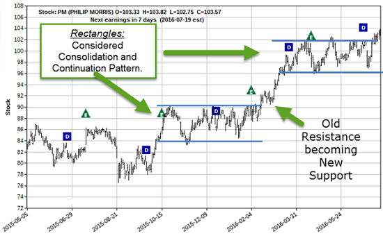
Have a look at these two rectangles on Philip Morris International Inc. (NYSE: PM):

Look at the period of time in which the consolidation is happening. The time during which the stock (PM) is trading between both a support and a resistance area gives astute options traders like us the opportunity to trade this pattern itself.
You can wait for the stock to breakout... or breakdown, but in the meantime the (savvy) options trader can capitalize each time the stock trades from one side of the range to the other.
That's right, you can make money on the same stock twice (or more) in short order.
Traders live for stuff like this, but this type of pattern can drive investors crazy!
For example, say they bought the stock at the beginning of the range on support. Fast forward three months or so, and the stock is at the support area, leaving investors with... zero appreciation.
Meanwhile, we options traders may have placed three different money-making trades in that same time frame, buying call options on support and selling them at resistance.
It's a beautiful thing. And it gets better. Check out this other example...
Let's say the stock breaks out above resistance (look for it to do so on decent or above average volume), just as it did in mid-February 2016, when it broke above $90 and ran up to $102.
If you missed getting the stock at $90 or sooner, you may have thought that picking it up around $92 or $93 was too expensive because it already broke out. You may have also thought that if people take profits or deem it overvalued, it will probably come down in price and they will be stuck in a losing position.
But what few people realize is that prices on a breakout can (and often times do) come down and test that breakout area before climbing higher. This breakout area is resistance, which we took a close look at when talking about "old resistance becoming new support" (ORNS).
When the price breaks out with volume backing it up, look for the price of the stock to come down a bit due to some profit taking. This retracement in price should be short-lived and done on less volume than was shown on the breakout.
The stock comes down to the old resistance price of around $90 - and those who didn't get it the first time and wanted to get more at the initial price start buying again. Lo and behold... you've got a stock that makes a run higher.
It is that period of time where the stock is retracing a bit after the breakout that the stock is establishing that ORNS situation.
Now if you look closely at what the chart pattern formed after the breakout of $90, you will see a triangular pattern instead of rectangular one. But again, we're going to talk about that another time.
Here's what I'm looking at this morning...
You Can Go "Big Time" with This Pattern
Now, one of the really cool things about this concept is that you can apply it to the entire stock market just as easily as you can single stocks.
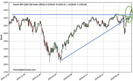
The S&P 500 (SPX) is trading close to all-time highs and has broken out above a resistance area. And for the last four days, including today, it's continued higher - and could very well go higher still.

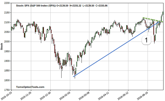
As we discussed previously, the SPX broke down through an ascending support area down to the price area of 2,000. And if you look back, you can argue that it's a support area for the SPX as well.
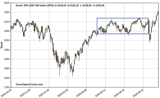
Here's one more example of another rectangle pattern where the support area is a little higher than 2,000:

It broke down through that support before hitting 2,000. Then, it bounced back up into that range and has proceeded higher to where it sits now. On that breakdown, SPX's price had the chance of coming back to the support area and consolidating before proceeding lower.
But it didn't....
There Are Bullish Opportunities in the Continuation Pattern
[mmpazkzone name="in-story" network="9794" site="307044" id="137008" type="4"]
Now many traders observe that if the stock, exchange-traded fund, or index doesn't hold or close above the area it broke from for three days, it may be a false break. Some traders I know are a bit more aggressive and willing to take a trade if it holds for only one day, and some even just need the price to trade above the break point, not needing it to close above or below. But I think that's too risky and that a three-day hold is the way to go.
And that makes me inclined to stay long in my trades and see what the SPX and the markets do from here.
As of today, I wouldn't be surprised to see prices move higher on a sentiment of "strength begets more strength." This leaves the prospect of people chasing after these prices for fear of missing out pretty open. Just remember... you should never chase prices.
There is also the camp of folks who may feel more confident at these higher prices and will continue to buy. But there may also be the contrarian view (that far too many financial and news pundits share) that these prices can't be sustained.
And that's exactly why I wanted to show you how to be visually be aware of support and resistance points and their corresponding patterns. That way, you can be more confident in your buying-to-open and selling-to-close trading decisions.
I'm ready for markets to go even higher, but I'll be ready if prices dribble back to 2,100-2,130 or so (the solid horizontal blue line). I will also consider a retrace to 2,100 (the green dashed line on the chart below), where old resistance (descending resistance line) could possibly become a new support area for the S&P 500 - especially after we see what unfolds today.

So check the volume on the retracement (if it happens) and see if it did so on weaker volume. Once you see a possible continuation pattern, like that triangle, zig-zig, or flat pattern I referenced above, and get the sense that markets should hold this "old resistance area as new support," you can count on bullish opportunities.
More from Tom: This Is Perhaps the Easiest Investing Strategy Ever Invented
You make one simple move on Monday, you exit that same move before Friday's closing bell... with a unique play that's guaranteed - by law - to pay out all available closing profits that same day. You never need more than $500 to get started, and the results show this remarkably simple method can beat the markets by 10, 20, 30, even 50 to 1. To see how you can take full advantage (starting this week), click here now...
Follow Tom on Facebook and Twitter.
About the Author
Tom Gentile, options trading specialist for Money Map Press, is widely known as America's No. 1 Pattern Trader thanks to his nearly 30 years of experience spotting lucrative patterns in options trading. Tom has taught over 300,000 traders his option trading secrets in a variety of settings, including seminars and workshops. He's also a bestselling author of eight books and training courses.


