The two significant pullbacks in the past three months have made the specter of a stock market crash in 2015 much more plausible.
In the past week, the Standard & Poor's 500 Index has rebounded from a 5% drop this month. Back in October, the S&P 500 plunged 7.5% before recovering.
Is the market trying to tell us something?
We found seven charts that explain why the markets have repeatedly stumbled this year - and why a bigger stock market crash in 2015 looms on the horizon.
Taken together, these charts paint an unsettling picture of a market on a shaky foundation. With the current bull market now 5.8 years old - the average is 3.8 years - investors need to be careful.
This doesn't mean investors should sell every stock they own in a blind panic. But it does mean investors must be selective and remember to use trailing stops.
Now, let's take a look at those charts. Forewarned is forearmed, as they say...
7 Charts That Warn of Stock Market Crash 2015
The stock market can only ignore these numbers for so long:
Stock Market Crash Chart No. 1: Oil and the S&P 500
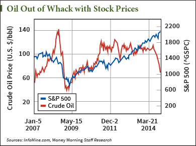 Over the past few weeks, nothing has gripped the financial world like the plunge in oil prices. Oil prices are down 28% just in the past month and more than 46% from their highs for the year.
Despite the recent pullback, stocks haven't followed oil. But as you can see in the chart, oil prices and stock prices usually don't diverge by much. And when they do, it's not for long.
For the moment, traders seem to be hoping lower oil prices will stimulate economic growth. But one of the less discussed reasons for oil's decline is falling global demand from a slowing global economy.
Looking at this chart, either oil prices need to rise or stock prices need to fall. Which do you think is more likely?
Editor's Note: A CIA economist has just leaked the Fed's knowledge of a 25-year depression and what could lead to a $100 trillion American meltdown. To see the evidence, click here.
Stock Market Crash Chart No. 2: The Shiller P/E Ratio
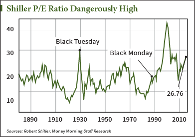 The cyclically adjusted price/earnings (CAPE) ratio, created by Robert Shiller, smoothes out the price/earnings (P/E) ratio by averaging it over 10 years.
Now at 26.76, the Shiller P/E is way over its long-term average of 16.5. Note that the Shiller P/E has only been higher twice. It hit 30 at the end of the 1920s, just before the stock market crash of 1929. And it soared to 44 at the end of the 1990s, just before the dot-com stock market crash.
This spike is incredibly important for investors to know about – and this next market crash chart underscores why…
Stock Market Crash Chart No. 3: Stocks Have Jumped Ahead of Projected Earnings
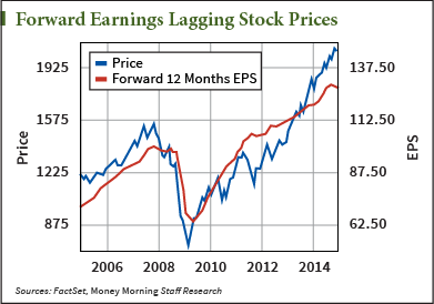 For most of the time since the bottom of the last big stock market crash, the forward P/E of companies - calculated with what they're projected to earn over the next 12 months - trailed stock prices.
But at the end of last year, the lines crossed. Through most of 2014, the gap between stock prices and projected earnings has grown wider. That means higher stock prices have to come as a result of higher P/E ratios.
But the Shiller P/E is far above its historic average. And so is the "regular" P/E for the S&P 500. Right now that P/E sits at about 20 - substantially higher than the 15.5 long-term average.
Stock Market Crash Chart No. 4: Profits Are Unusually High, Too
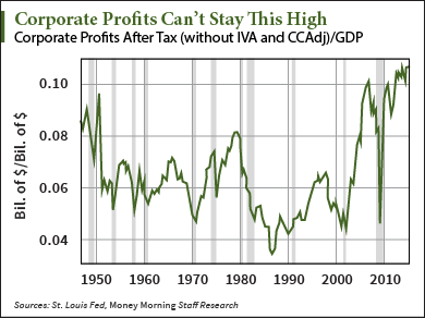 Fatter profits aren't going to save the day in 2015, either.
Corporate profits as a percent of gross domestic product (GDP) have never been higher. As the chart makes clear, whenever profit margins get too high or too low, they correct (or overcorrect) back to the average.
If profit margins start to revert, given what we've seen in the previous charts, a stock market crash can follow.
Stock Market Crash Chart No. 5: Fed Tightening Won't Be Pretty
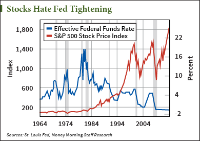 Last week the U.S. Federal Reserve maintained its fuzzy outlook for raising short-term interest rates from near zero. But even the Fed knows it needs to raise rates at some point. And when it happens, stocks won't like it.
The last two times the Fed did any significant tightening of rates, in 1999-2000 and in 2004-2007, stocks plummeted. Now, it's true that other factors played into those stock market crashes. And stocks do not plummet every time the Fed raises rates.
But this time the rate hike will follow the end of the QE trillions flowing into the market. This combined with a rate hike will hurt the market's psychology of "addictive personality disorder and compulsive behavior," as our Chief Investment Strategist Keith Fitz-Gerald calls it.
That's why the markets react so strongly to whatever the Fed says. Note that the Fed's open-ended stance on any rate hike this week pushed the Dow Jones Industrial Average up more than 700 points in two days.
Imagine what will happen when the Fed finally reverses course.
Stock Market Crash Chart No. 6: We're Still Loaded with Debt
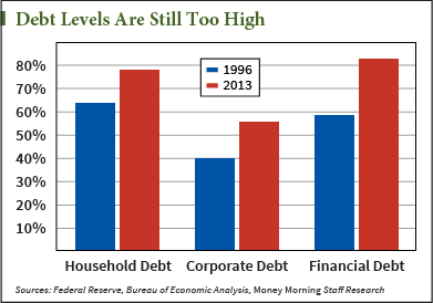 The United States still has a lot of debt. Household debt, national debt, corporate debt, you name it. Debt levels in the United States are still higher than they were in 1996, before the tech and housing bubbles.
Households, for example, would have to reduce debt by $2.5 trillion to get back to 1996 levels.
While there has been some deleveraging over the past few years, everyone owes more than they should.
Yes, debt can help fuel growth. But too much debt becomes a burden, especially when interest rates rise. When the Fed finally does pull the trigger on rates, high debt levels will exert a massive drag on the economy. And that will hurt stocks.
Stock Market Crash Chart No. 7: The Seven-Year Cycle Is About to Turn
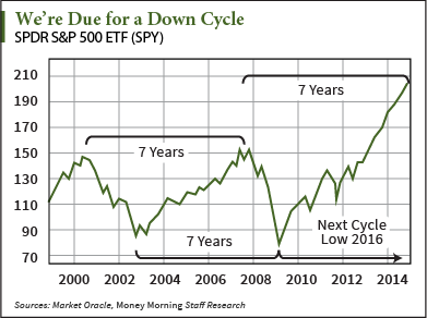 Some market patterns defy explanation, and yet they occur over and over. The seven-year cycle of booming and crashing markets is one such pattern.
It was seven years from the market top in 2000 to the one in 2007. And it was seven years from the market bottom in 2002 to the one in 2009.
Now, we haven't had a stock market crash every seven years like clockwork, but it has happened often enough to give investors pause.
In 1994 we had a bond market crash. In 1987 there was Black Monday. In 1973 a stock market crash began that bottomed out in 1975. The worst year for stocks in the Great Depression was in 1931, which fits into the seven-year cycle.
According to the cycle, the year 2014 is a stock market peak. And the next stock market crash is due by 2016 - or possibly the end of 2015.
What to Do After a Stock Market Crash: Sooner or later, there will be another stock market crash. It’s just the nature of the markets. So it’s a good idea to have a strategy ready for a market pullback. It’s definitely not a “run-for-the-hills” moment. Investors can just do this instead…
Follow me on Twitter @DavidGZeiler.
About the Author
David Zeiler, Associate Editor for Money Morning at Money Map Press, has been a journalist for more than 35 years, including 18 spent at The Baltimore Sun. He has worked as a writer, editor, and page designer at different times in his career. He's interviewed a number of well-known personalities - ranging from punk rock icon Joey Ramone to Apple Inc. co-founder Steve Wozniak.
Over the course of his journalistic career, Dave has covered many diverse subjects. Since arriving at Money Morning in 2011, he has focused primarily on technology. He's an expert on both Apple and cryptocurrencies. He started writing about Apple for The Sun in the mid-1990s, and had an Apple blog on The Sun's web site from 2007-2009. Dave's been writing about Bitcoin since 2011 - long before most people had even heard of it. He even mined it for a short time.
Dave has a BA in English and Mass Communications from Loyola University Maryland.


